Ever wondered how a RailAdvent news article looks to members?
How the site looks is just one of the benefits of subscribing to RailAdvent
Over the latest couple of weeks, we have been tweaking the layout for members further, changing where the sidebars are and how the content is presented.
We would share a comparison with everyone, just so you can see the difference.
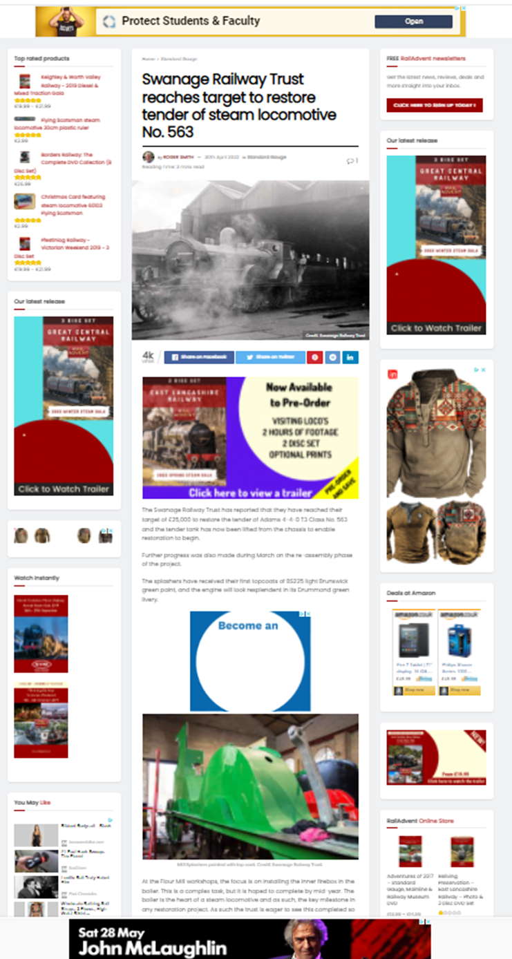
In this first image, you can see the standard layout

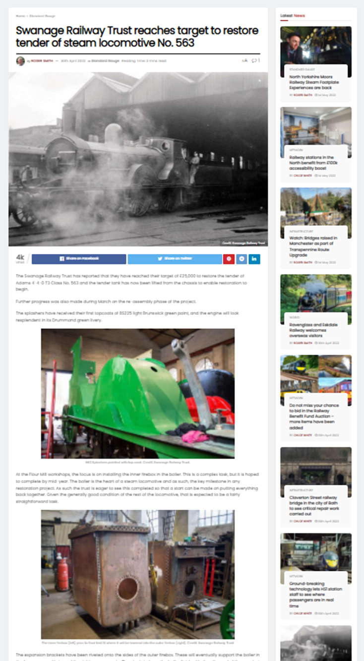
Now lets compare this to the layout RailAdvent Plus members see

Straight away you can see there is just one sidebar, to the right, we are still customising this area to include relevant shortcuts for members.
Also, you can see that the Google Ads are gone, we have just one RailAdvent info ad appearing further down the page.
This new layout for members not only removes the Google Ads, but creates a much cleaner magazine style reading experience.
For those of you who are already members, watch out for more improvements over the next few months.
If you are not already a member, this is just one of the many benefits of membership, click here to find out all the benefits you get and signup today.
Questions? Use the live chat in the bottom right, and we will be happy to help.


Responses