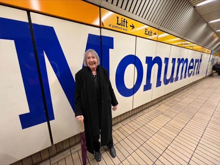
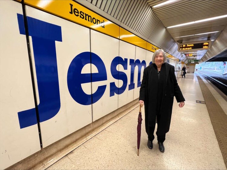
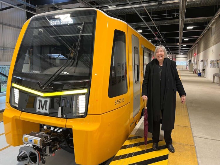
The pioneering graphic designer Margaret Calvert visited the Tyne and Wear Metro last Tuesday, 26 March, to view the iconic typeface she created when it opened in 1980.
Margaret Calvert has done much to shape the visual identity of modern Britain, and the Calvert font typeface she created for the Metro system is immediately recognisable.
She designed the large yellow ‘M’ cubes outside Metro stations, on its trains, and across the network, including giant wall graphics on the platforms of Metro’s underground stations.

During her visit, Margaret Calvert was taken to the Nexus Learning Centre in South Shields, where she saw her logo on the new Metro train fleet.
She also travelled on the Metro to view her typeface at Jesmond, Monument, Haymarket, and Central Metro stations.
In December 2021, Margaret Calvert viewed her designs at Tyne and Wear Metro stations on the Sunderland line, but this was the first time that she had seen her designs on the Metro system in Newcastle.

With a career spanning over six decades, Margaret Calvert has helped to shape the nation’s visual identity.
Signs for Road and Rail
Margaret Calvert is best known for her collaboration with Jock Kinneir on the design of Britain’s road signs, starting with the motorways in the late 1950s and early 1960s, and has also designed signs for British Rail and the British Airports Authority
She designed her own lettering for the Tyne and Wear Metro, which is now marketed under the name ‘Calvert’, for Monotype, and her latest work has been the design of Rail Alphabet 2, in collaboration with Henrik Kubel, for Network Rail.
Her designs for the Tyne and Wear Metro were exhibited at London’s Design Museum in 2020.

It was a huge honour to welcome Margaret Calvert on the Tyne and Wear Metro to see her design work at first hand, on our stations in Newcastle, and on our amazing new trains.
This is the woman who created Metro’s iconic typeface, which is at the very core of the brand. The Metro logo has become one of our region’s most iconic symbols and that was all thanks to Margaret’s work for us in the late the 1970s.
The visit was her first ever chance to see her designs on our underground stations through the centre of Newcastle, which I know was a particular thrill for her. More than 40 years after she created that familiar Metro logo she got the chance to see how her work has shaped Metro.
It’s a design which has stood the test of time. Margaret’s work for Metro, both the font and the way it is used throughout the system, will be with us for many years to come.
Huw Lewis, Customer Services Director at Nexus


Responses